Redheads: Art Strikes Back
Redheads, Australia’s beloved match brand, held a competition in 2025 to celebrate their 80th anniversary. Artists were invited to redesign their iconic packaging based on three different themes:
Celebrate Redheads’ place in Australian culture.
Spark a vision for the next 80 years.
Re-imagine the infamous Ms. Redhead.
Winners had their artworks printed on limited edition matchboxes.
Choosing the theme, ‘celebrate Redheads’ place in Aussie culture’, I drew inspiration from my own camping trips in the Victorian High Country. After finishing a long day of hiking, I have fond memories of sitting around the campfire - or a trangia circle - toasting marshmallows and telling stories. I wanted to capture that shared experience camping in the Australian bush, and took inspiration from the Space and Safety matchbox designs of the 1960s and 70s. I submitted my design as an entry to this competition.
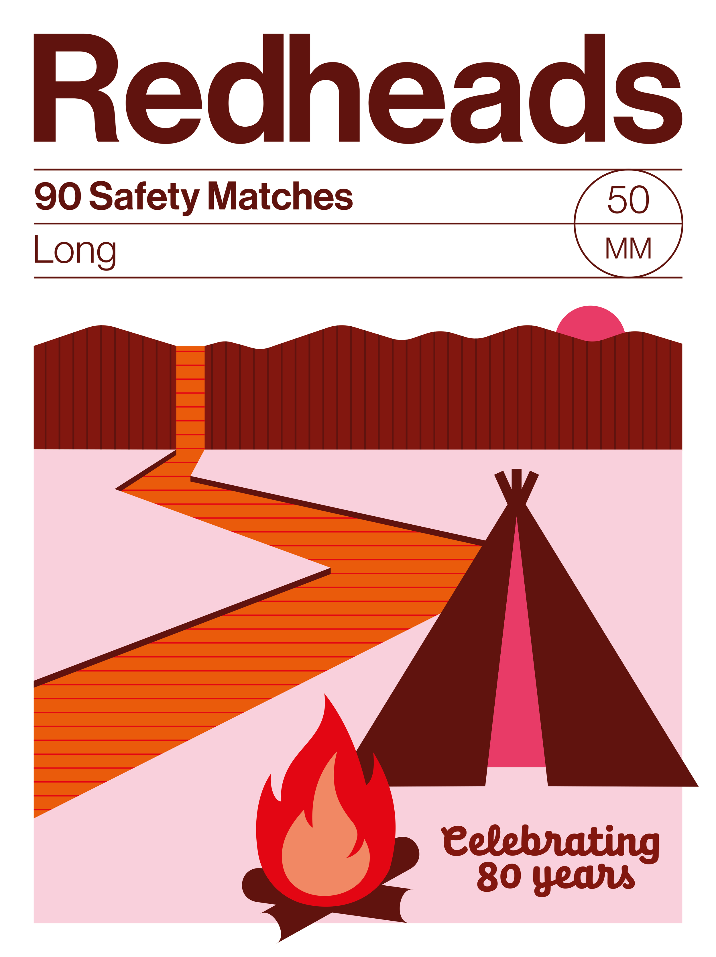
Final submission
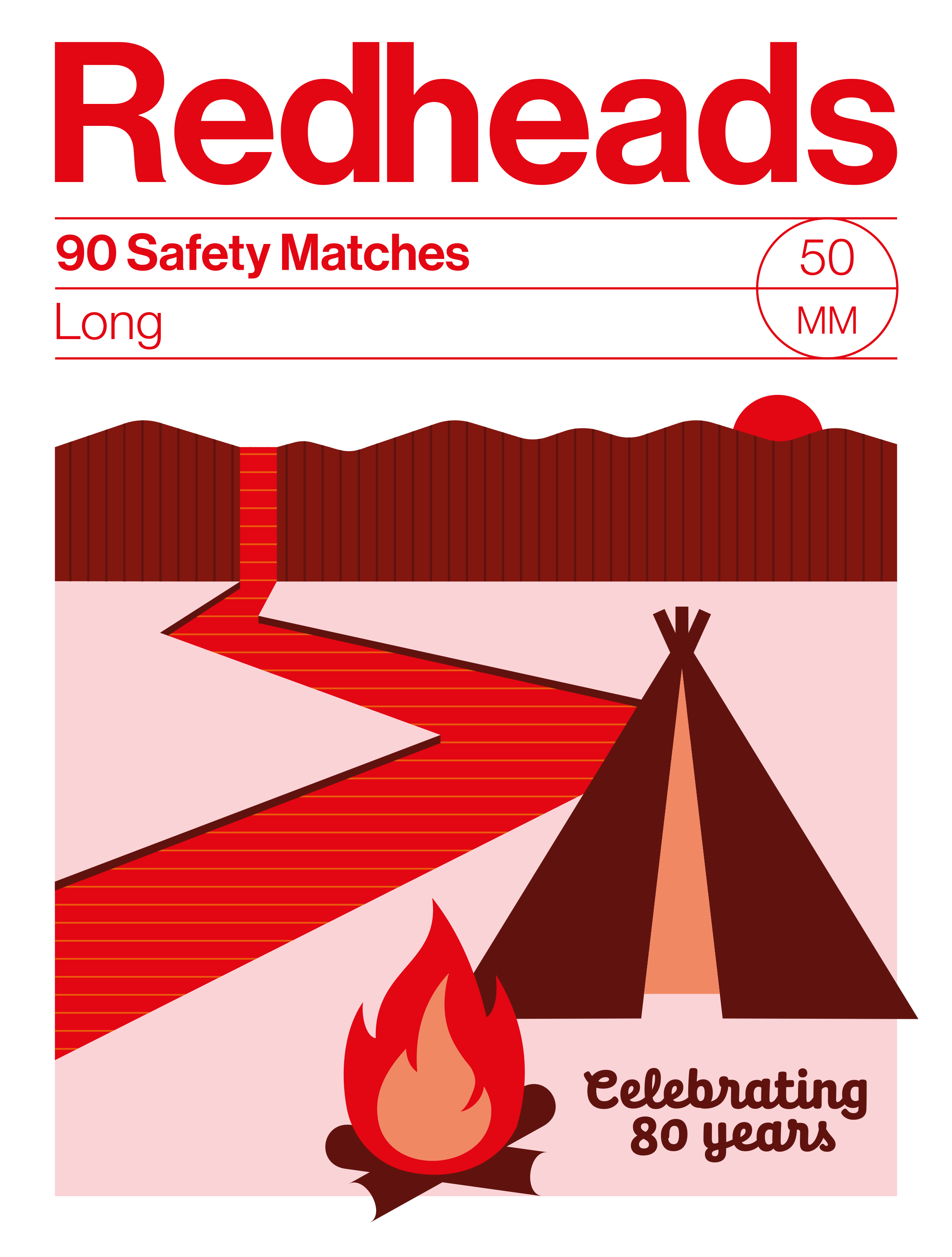
Alternative colour test
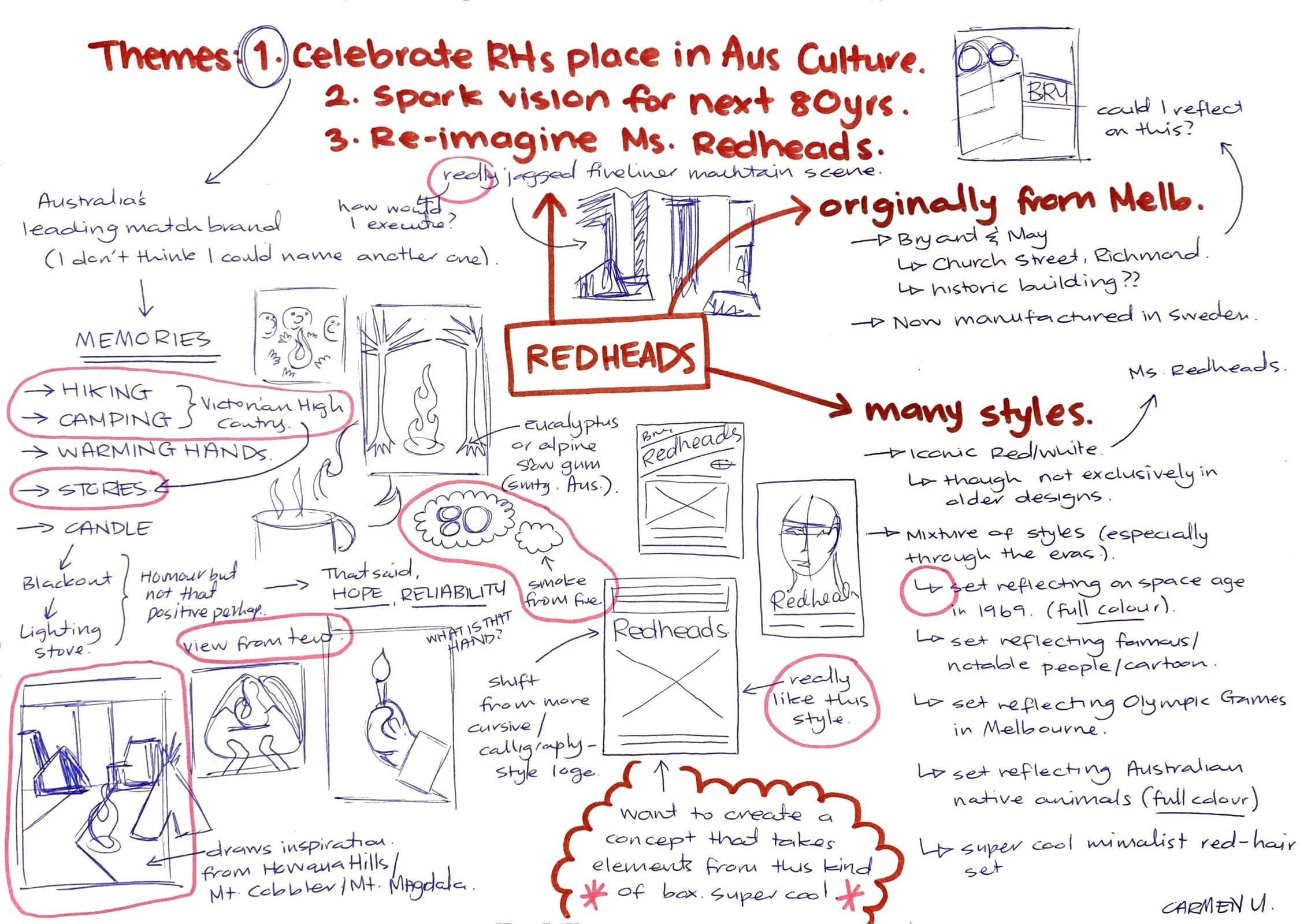
Early illustration planning
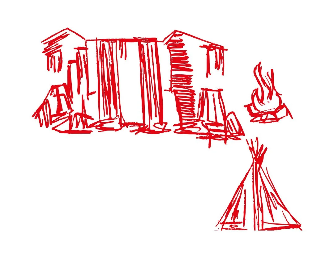
Early sketching